
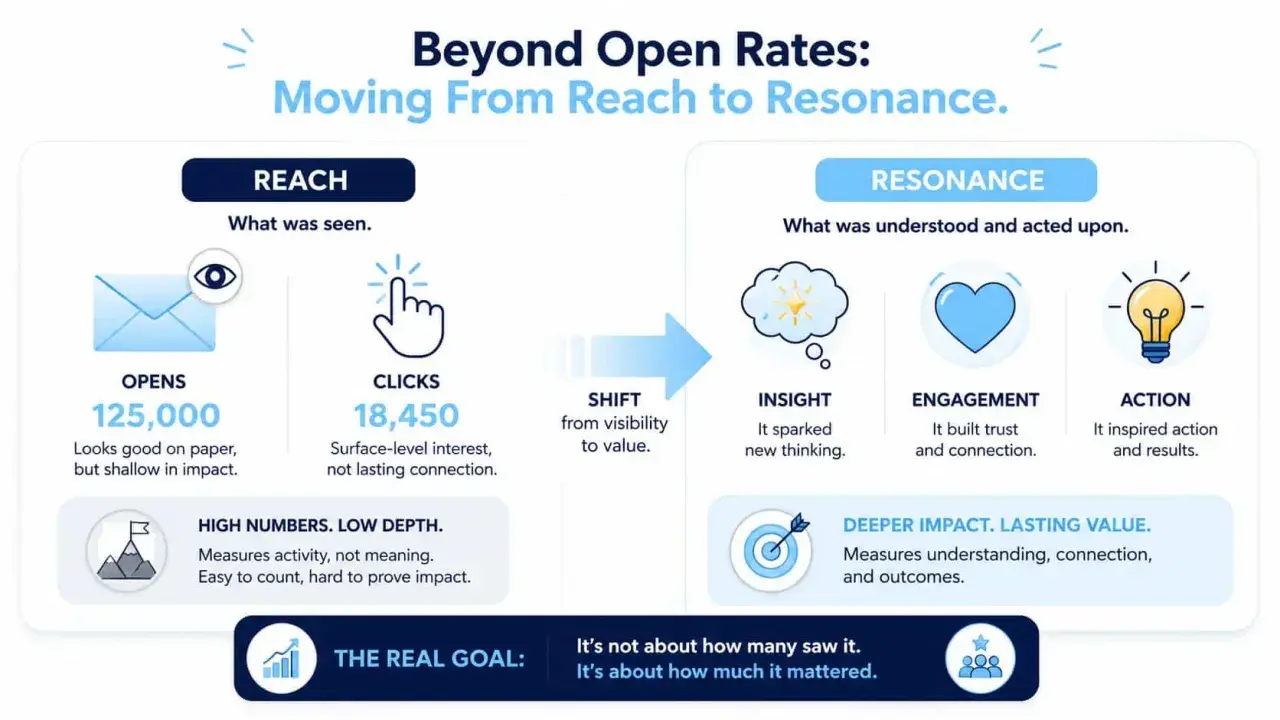
The clearest measurement systems track reach, understanding, and action
- Start with the business outcome, not the channel report.
- Use a mix of quantitative data and employee feedback.
- Open rates are only a reach signal, not proof of understanding.
- Segment results by role, location, and audience type.
- Review monthly for trends and quarterly for leadership decisions.
- Close the loop by changing something visible after you collect data.
What good internal communication measurement needs to prove
I find it useful to treat communication measurement like a three-layer test. First, did the message reach the right people? Second, did they understand it well enough to act? Third, did it change behaviour, confidence, or alignment in a way that matters to the organisation?
Reach tells you whether the channel is working
Reach is the easiest layer to track because it sits closest to the delivery mechanism. Email opens, intranet visits, app logins, and notification clicks all help answer one simple question: did employees actually see the message? That matters, but it is only the starting point. A message can be widely seen and still be ignored, skimmed, or misunderstood.
Understanding tells you whether the message landed
This is the part many teams skip. If employees can repeat the key point back in their own words, explain what changes for them, or answer a short pulse question correctly, you are closer to real effectiveness. I care about understanding because it reveals whether the communication was clear enough to survive busy schedules, mixed channels, and competing priorities.
Action tells you whether communication changed anything
Action is the most useful layer for leaders because it connects communication to outcomes. That might mean policy acknowledgement, training completion, event attendance, fewer repeat questions, better manager cascade, or faster adoption of a new process. In UK organisations with hybrid and frontline teams, this is often where the biggest gaps show up, because not every employee works in the same channel or the same rhythm.Once you know what you are trying to prove, the next step is choosing metrics that do not flatter the data.
The metrics that matter more than open rates
Open rates still have a place, but I would never let them dominate the story. They are a useful reach indicator, not a verdict on whether communication was effective. Recent benchmark data summarised by Staffbase from PoliteMail suggests average internal email open rates around 64%, with smaller lists often performing above 80% and click rates for larger distributions commonly sitting in the 7% to 15% range. I use numbers like that as context, not as a goal to chase blindly.
| Metric | What it tells you | Where it can mislead | Best use |
|---|---|---|---|
| Open rate | Whether the audience saw the message | Does not prove reading or understanding | Newsletters, announcements, campaign reach |
| Click-through rate | Whether the content created interest | Clicks can reflect confusion as much as clarity | Links to policies, intranet articles, event pages |
| Read depth or time on page | Whether people stayed with the content | Long reads can still be passive | Longer leadership updates or guidance pages |
| Survey response rate | Willingness to engage | May overrepresent already engaged employees | Pulse surveys and quick feedback checks |
| Comment and reply volume | Whether people felt safe enough to respond | Volume is not the same as quality | Change communications, questions, and listening posts |
| Completion or acknowledgement rate | Whether people followed through | Completion does not always equal comprehension | Policy updates, training, compliance items |
| Manager cascade completion | Whether leaders passed the message on | Consistency varies by manager skill | Major change, restructuring, culture messaging |
| Behavioural outcome | Whether communication influenced action | Other factors may also affect the result | Adoption, attendance, reduced errors, faster uptake |
For me, the best dashboards combine at least one metric from each layer: reach, engagement, and outcome. If you only track reach, you get visibility without meaning. If you only track outcomes, you lose the chance to diagnose why something worked or failed. That balance becomes much easier to manage once you decide on a measurement rhythm.
The next question is not “what can we measure?” It is “what should we review, how often, and for whom?”
How to build a measurement rhythm that fits real work
A useful measurement system does not need to be complex. It needs to be consistent. In my experience, most internal communication teams get better results by choosing a small set of indicators and reviewing them on a fixed cadence than by building a sprawling report nobody uses.Start with the business question
Every campaign should begin with one clear question. For example: Do employees understand the new policy? Are managers equipped to explain the restructure? Did the wellbeing campaign reach the teams most likely to need it? When the question is clear, the metric choice becomes obvious.
Set a baseline before you change anything
Baseline data matters because it tells you whether your effort actually moved the needle. If the average click rate on a monthly update was 11% last quarter and 14% after you changed the format, that is useful. Without the baseline, that same 14% means very little.
Choose a cadence that matches the speed of change
- Weekly works best for live campaigns, crisis updates, or fast-moving transformation work.
- Monthly suits most internal communication reporting because it is frequent enough to spot trends without creating noise.
- Quarterly is useful for leadership reviews, especially when you want to connect communication to employee engagement or organisational outcomes.
That cadence is also where Simpplr’s 2026 State of Internal Communications report lines up with what I see in practice: credible measurement and clear audience targeting are what separate scalable programmes from ones that stall. In other words, the rhythm matters as much as the report itself.
Once the rhythm is in place, feedback becomes more useful, because you are not collecting random opinions. You are collecting evidence.
What employee feedback adds that dashboards cannot
Analytics tell you what happened. Feedback tells you why. That distinction matters because the numbers alone rarely explain whether a message was unclear, irrelevant, badly timed, or simply aimed at the wrong audience. I do not treat employee feedback as a softer version of data; I treat it as the context that makes the data usable.
Pulse surveys are best when they stay short
Pulse surveys work because they are quick, repeatable, and close enough to the moment of communication to capture a real reaction. I prefer to keep them short enough to finish in under five minutes and focused on one theme at a time, such as clarity, usefulness, trust, or relevance. They can run weekly during a major change, monthly for active programmes, or quarterly when the communication environment is more stable.
Open comments often reveal the real blockers
Closed questions are easy to quantify, but open comments often tell you where the friction sits. If people say they understand the message but still do not know what to do next, the problem is probably action clarity. If they say the message feels generic, the problem may be audience targeting. I have found that a small number of well-chosen comments can be more valuable than a large volume of vague scores.
Managers and team leads are a measurement source, not just a delivery channel
Line managers often know where communication breaks down before the dashboard shows it. They hear the repeated questions, the confusion in team meetings, and the objections that never make it into formal feedback. If you are serious about communication quality, create a simple way for managers to report what they are hearing. That is especially important in UK workplaces with mixed office, hybrid, and frontline teams, where the formal channel rarely tells the whole story.
Feedback is powerful, but it can also mislead if you read it too quickly. The next section is where I separate useful signal from comforting noise.
How to read the signals without fooling yourself
A dashboard can look healthy while the communication itself is weak. The trick is to read patterns, not isolated numbers. When I review a campaign, I look for combinations of signals that tell a more honest story.
| Pattern | Likely explanation | What I would do next |
|---|---|---|
| High open rate, low click rate | The subject line worked, but the body may be too long, too vague, or too weak on next steps | Shorten the message, tighten the call to action, and test a more direct format |
| Good survey scores, poor behavioural follow-through | People may like the tone of the communication but not see its relevance or urgency | Strengthen manager reinforcement and explain consequences more clearly |
| Strong HQ engagement, weak frontline engagement | The channel mix may not fit how frontline teams actually work | Use posters, shift briefings, SMS, team huddles, or manager cascades instead of email alone |
| Lots of comments, little action | The message created concern, but the follow-up was not visible enough | Publish what changed, what did not, and when people can expect the next update |
| High completion, low understanding | People may be clicking through to clear a task without really absorbing the content | Add a comprehension check, a short explainer, or a manager talking point |
I also watch for one common trap: assuming silence means indifference. Sometimes silence means the channel is wrong, the audience is overloaded, or the timing is bad. In other words, a poor response is not always a content failure; sometimes it is a delivery failure.
That leads directly to the mistakes that make communication look better than it is.
Common mistakes that distort the picture
- Chasing too many metrics makes the work noisy and harder to act on.
- Measuring every channel the same way ignores the fact that email, intranet, meetings, and SMS play different roles.
- Ignoring segmentation hides the gap between office-based teams, remote teams, and frontline staff.
- Reporting numbers without interpretation leaves leaders with data but no decision.
- Collecting feedback without visible change teaches employees that their input goes nowhere.
- Confusing activity with impact rewards volume instead of clarity, trust, or action.
The strongest internal communication teams do not just count outputs. They also ask whether the right audience was reached, whether the message was understood, and whether anything changed as a result. That is the difference between a reporting habit and a real measurement system.
If you want one practical filter, use this: if a metric does not help you decide what to do next, it probably belongs in a secondary report, not in the main dashboard.
What to keep in place after the first reporting cycle
After the first month or quarter, I would keep the system deliberately simple. One dashboard, one feedback loop, one reporting cadence, and one visible action in response to what you learned. That is usually enough to build momentum without drowning the team in measurement for its own sake.
- Track three reach metrics, three engagement metrics, and two outcome metrics.
- Run a short pulse survey after major changes or on a quarterly rhythm.
- Ask managers for a monthly readout of the questions they keep hearing.
- Publish one short leadership note that explains what the data means and what will change next.
If you keep the measurement tied to real decisions, internal communication becomes easier to trust and easier to improve. That is the real value here: not proving that communication happened, but showing which messages actually helped the organisation move in the right direction.
